Productizing A Platform
LESSONS LEARNED
Creating a cohesive brand story around the software underpinning Condé Nast was made easier due to the rich company history. The design team found a wonderful moment in company history to anchor the voice and aesthetic. This gave us a unique and authentic starting point for the value conversation we were bringing to the crowded enterprise CMS market.
The Opportunity And Hypothesis
Up to this point, the Condé Nast internal digital products team had been building software tools and services on an as-need basis for the 17 brands. These tools over the years had grown into a high functioning suite that was maturing to a point where it became interesting to package and present them to the commercial market.
Telling the story of a technology group inside an organization with such a deep heritage was exciting because we saw an opportunity to blend the past with the future. A rare chance to launch something truly modern with a rich back-story.
How might we:
"How might we, as a design team, wrap the platform in a brand that tells a story of technical excellence and authority while honoring the heritage of Condé Nast?"
Hypothesis:
We, as a design team, believed that we could find in the Condé archives a guide and a source for our story. And with that kernel of a beginning, we could build a brand that was distinct from competitors and therefore memorable, long-lived, and scalable.
The Challenge(s) Overcome
When researching the history of the company, we quickly found that uncovering inspiration and sources of excellence in design and leadership wasn’t the challenge because there were many. The real challenge was to decide which of the many quality examples was the best for our purpose.
Naming. Oh to inclusively and robustly name a thing. Coming to consensus on a name, and then checking the name with legal, then clearing the name with the executives, then testing the name with potential clients and target users, was a surprisingly long process, and one where I definitely underestimated the complexity.
Productizing a group of applications that were previously internal with internally facing support and API systems requires a very different mindset. Paying users require a more elevated service level agreement than internal users. Although the design was adjacent to these topics, I would still participate in the discussions from a strategy perspective as we would need to generate copy and screens to support the commercialization of this aspect of the platform.
The Players
LEADERSHIP
This was a top-down initiative and therefore we had full support from the CTO and the CDO.
I was given the budget to bring in contractors as needed to make deadlines and so brought in resources to lead the design aspect of the branding effort.
DESIGN
As mentioned, both design and research spent time diving into the history of the Condé Nast publications for an authentic source to anchor the story.
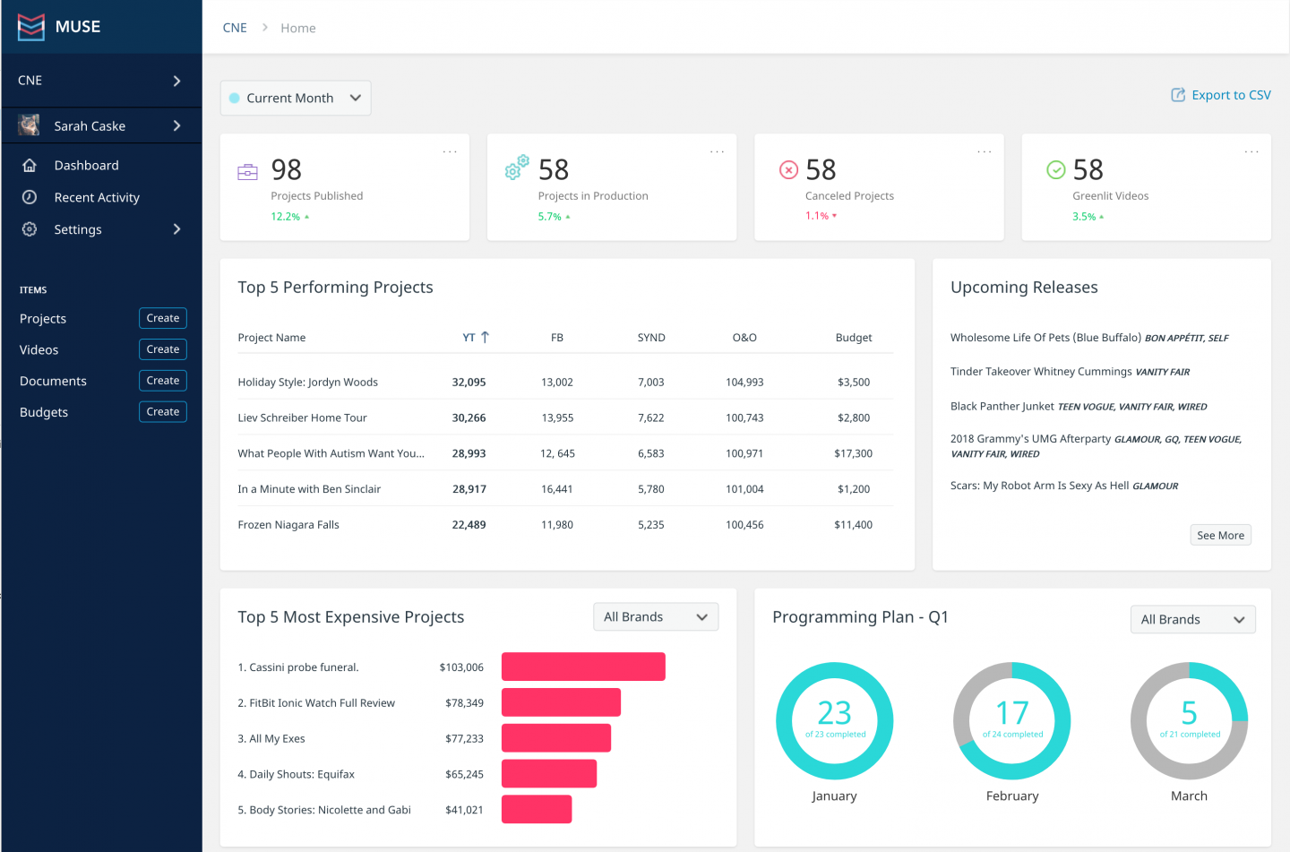
Because the main deliverable was a static marketing site, design also handled the code.
RESEARCH
Research would later lead workshops on naming and testing the name.
Copy would be written by Laura Carrol our research lead and vetted by executive leadership.
The Process
Design strategy
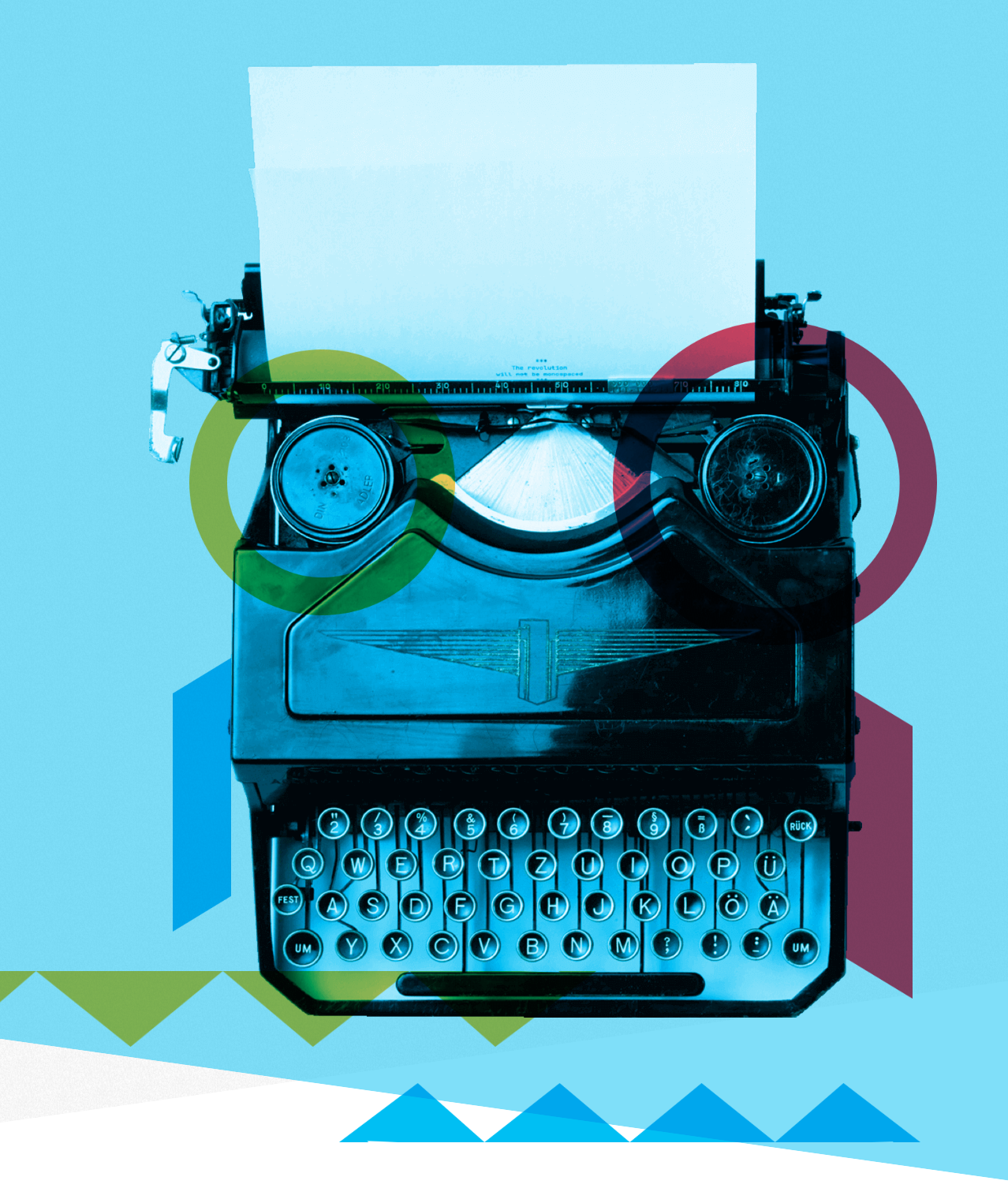
Design spent time digging in the history of the company and after a few preliminary meetings regarding findings, we unearthed the gem that would become the starting point and guide for the brand. Bradbury Thompson and his love for CMYK color separation as an aesthetic.
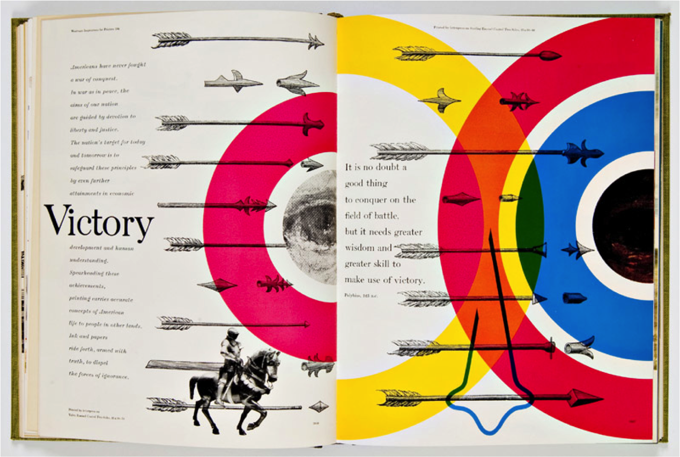
Thompson used a very specific approach to blending the photography, typography, and color that created an impression of movement.
CMYK in art was popularized by Bradbury Thompson, one of the most influential designers of the 20th century who also happened to serve as creative director of the magazine Mademoiselle after it was acquired by Condé Nast in 1959. Which meant we had found roots for our story.
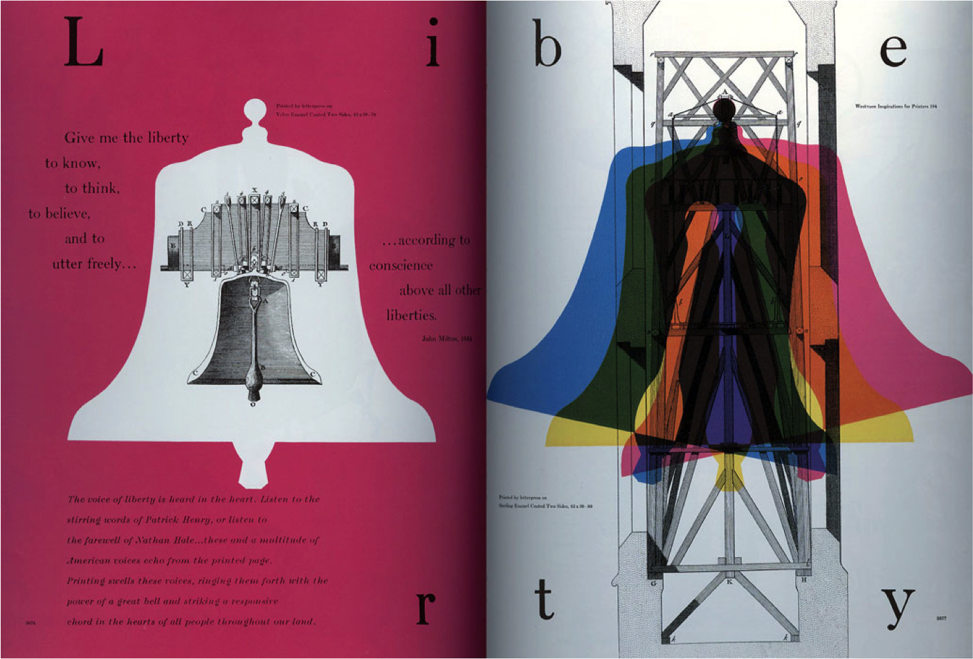
Bradbury Thompson Westvaco Inspiration for Printers No.194, 1953
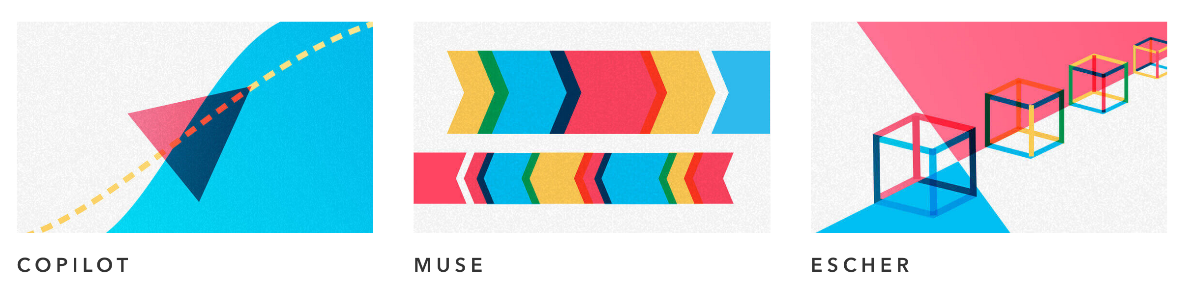
The idea of simple shapes overlapping and therefore creating new colors is interesting in a way that it is easily reproducible in the digital environment through the color blending modes (background-blend-mode in the web environment). Additionally, the current Formation logos already apply this technique through a blending of blue and red shades -- two of four basic colors that CMYK color system is based on.
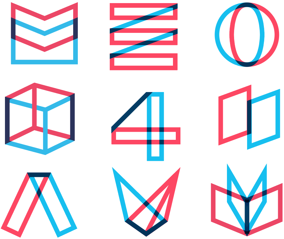
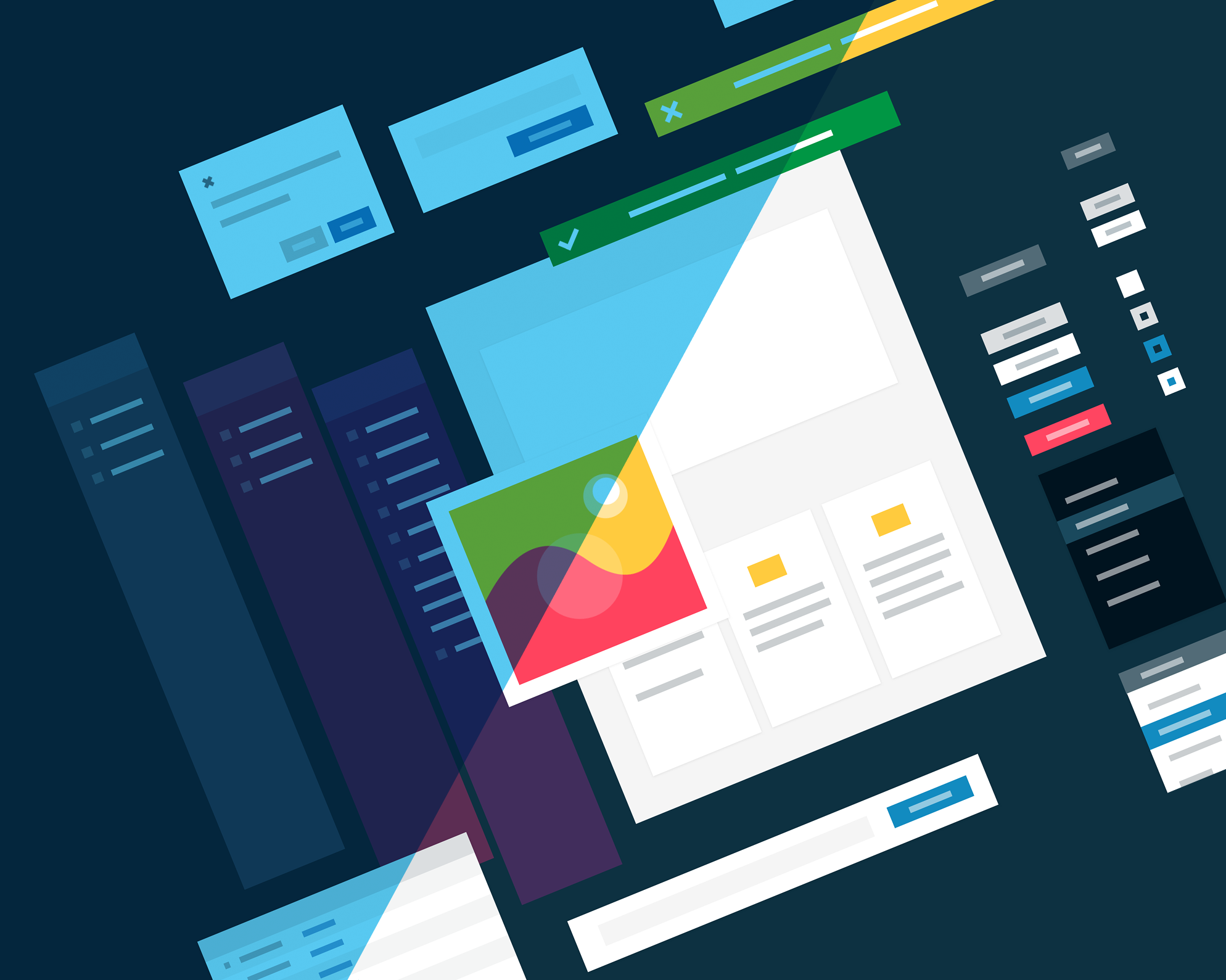
The logo set for the platform.
Illustrations made by overlapping shapes allow for a much higher level of creativity for designers on various levels. Also, illustrations with unique visual styles that are consistently applied throughout all communication channels contribute to memorability and are easily scalable. At that time, no competitor to Formation used illustration as their brand’s main visual element. They all used photos.
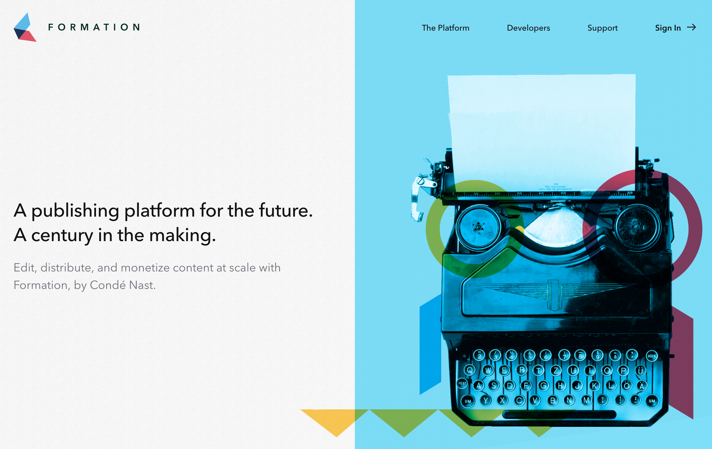
An example of the illustration used in the Formation website.
Research
With a strong visual story framed in something we were all very excited about, we started wrapping up the market research. We surveyed the landscape for comparative businesses, mapped their marketing site structure, cataloged their service offerings, even made a matrix of adjectives as to how they were describing themselves. Armed with this information, we were able to be sure we had coverage in the areas most common and could meaningfully differentiate our service offering.
UX/IA
Then came the site map and the copywriting. This was made easier due to the extensive market research and the fact that Formation as a platform had already done the work to establish a voice and tone for the platform internally. In a previous effort, we created a persona called “Cory”. They were the persona of the system itself. Cory was useful for designers and developers when they were making decisions for net new features, net new error messaging and generally creating continuity throughout the internal platform. Cory already had a professional demeanor consistent with our values as a company, so we decided to use them for our external voice and tone as well. This moved things along very quickly. The site map and written content were drafted in a week.
With the copy and sitemap complete, the layouts were set up and illustrations were produced. As a bonus, since the internal platform already had a design system that included a system of logos for the internal brands it gave is a strong lead on the illustrations. While this may have been problematic, in the end it dovetailed nicely with the Bradbury Thompson story.
After minimal design rounds, we settled on a set of screens for the site then everything was mocked up in code including written content.
The Outcome
This was an easy and exciting story to tell because I was truly proud to present the amazing work done by the team.
The project was greenlit in minutes and we were live 2 weeks later.
In total, from concept to launch, the project was completed in 3 months.